Hideki Satomi's packaging and copy design
the days stay the same.
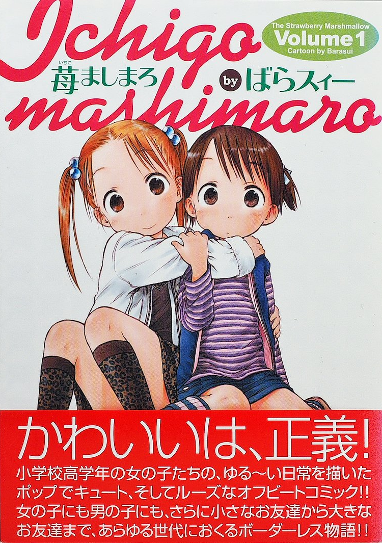
cute can only be something you know when you see it. sure, we might already share a common language that helps us understand what makes things cute, like large eyes or small faces, but cute is also a descriptor that we can never say has been fully charted. for one, the holy land of the absolute territory was only discovered just on the edge of this millennium. instead, we are better off thinking of cute as a problem space that can only be probed to discover what’s possible. stationery is cute. beetles are cute. a girl coughing up blood is cute. taxes and sewage can be cute, but only when personified as mascot characters. there is no single code that unifies these things, other than knowing that each holds claim to its own innate cuteness. that might have been the case, until one phrase emerged with a QED clarity that we now accept as a universal constant: cute is justice.
“cute is justice” brims with an auspicious power. initially appearing on ichigo mashimaro’s first volume, it quickly caught fire as something of a shibboleth that only became more fun to say each time you repeated it. look in the right places and you’ll start to find that it’s been creeping into the japanese lexicon for the better part of two decades, making inroads not only on tiktok and in fashion magazines where it has long outlived its original usage, but also wrapping back into manga peddled by competing publishers. unlike much otaku slang that has been usurped into the greater consciousness, often carried online in the winds of unattributed discussions, cute is justice is one phrase thats influence can be directly traced not only to its first use, but to the kindling set for it by its inventor, hideki satomi.
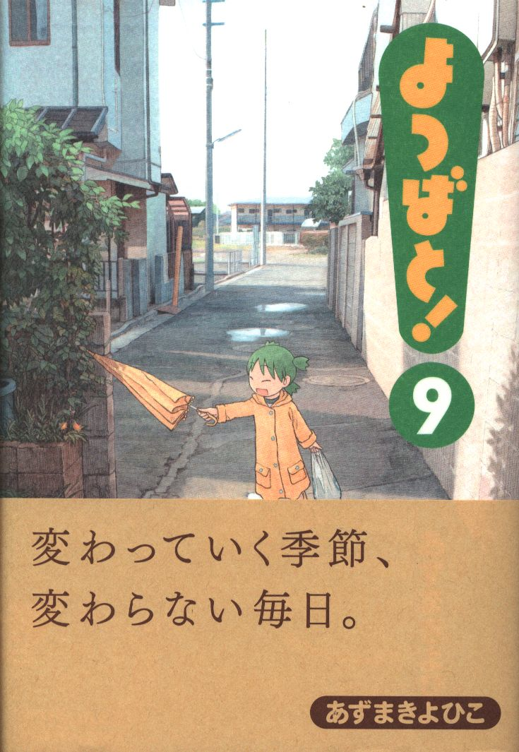
hideki satomi, a freelance designer with over thirty years of design history, has decorated jackets, promotional copy, and logotypes for many of the slice of life series that you’ll likely agree are some of the genre’s crown jewels, including azumanga daioh, yotsubato, nichijou, and many more. with a deeply tuned sense for blunt presentation, appreciating the quirky, and hyping the ordinary, he is one of the few figures in the world of commercial design for manga that can reasonably lay claim to a certain amount of fame. with a portfolio that has supported prolific names like kiyohiko azuma, barasui, and keiichi arawi in a continued role, there is perhaps no other individual you can credit as having supervised so closely over the boom period for moe manga.
Notes on liners
Friends,
Fun!
examining satomi’s output requires, or impresses upon one, a deep respect for the obi. obi strips, owing their name to the belts used to tie traditional japanese clothing, are a uniquely japanese invention in publishing, made more clear by there being no agreed upon translation for the concept1. as small paper bands that wrap around dust and album jackets, they at first served a purely functional purpose by providing kanji translations for international imports, usually with track listings, catalog information, and other details that contextualized them for a domestic market. this made the obi conveniently supplemental, and thus easier to update or replace in scenarios like price adjustments or when correcting typos, but it also enabled decorating over an underlying design, maintaining the aesthetic for the releases it adorned. by this token, obi were usually densely compact without any specific regards to hierarchy, and would seem to share more in common with a receipt than even any ornamental design element. early on in their development especially, this meant they were often absentmindedly discarded and treated more like disposable packaging. it is only more recently that they have become qualified as collectables, owing to designers that have elevated their language and regional releases that began to treat them with pageantry.
without specific context for the obi, especially as the concept is not really exported in any meaningful way, it is probably most valuable to look at a typical modern example to understand what someone like satomi is able to accomplish in relief. take a volume of oshi no ko, for example, and you’ll find a strip crammed with announcements, key art, prolific credits, and an invitation to scan a QR code. while the obi at an early point may have provided only a specific functional need, generations of publishing have seen it develop into more of a promotional billboard where negative space can only be considered wasted space. promotional design still travels through trends and eras, of course, as do all other design languages, but japan has long preferred a maximalist approach that mixes colors, typefaces, outlines, and skews to compete for attention, as the modern obi does when displayed at an aisle endcap. although it is always tempting to critique a design, it should be impressed that there is no specific failure to find in an example like oshi no ko’s, cramped as it is, because it is also perfectly tailored for that purpose. even more principally, it exhibits a style of promotional design that has evolved to encourage a darting gaze, even at the cost of overwhelming a cover with a cry for attention. this is the obi realized to its fullest, and it is if nothing other than a tested and proven approach.
standards, however, are meant to be defied. there is ample room even in this cramped understanding of the obi to practice a different approach and surprise expectations.
Early days with Pioneer LDC
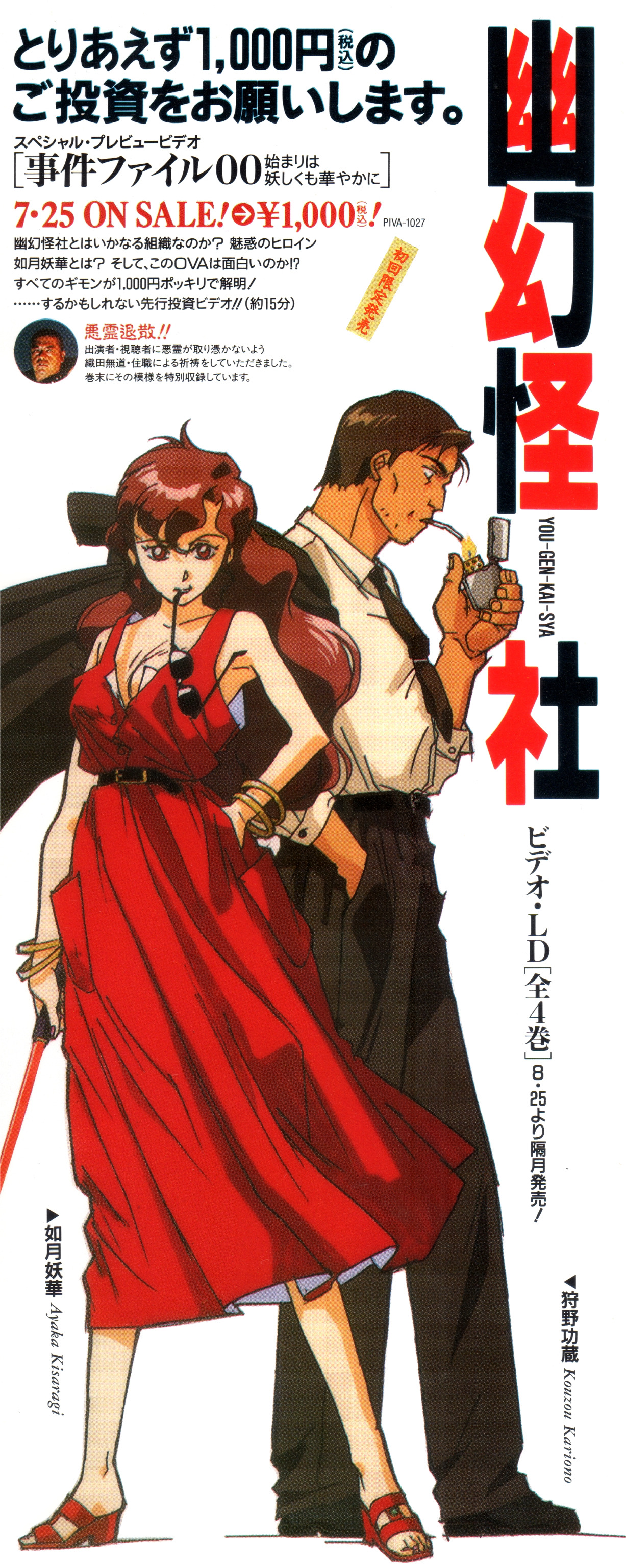
satomi was likely especially positioned to distill ideas about what an obi should or could present. before he was associated principally with manga, he began to cut his teeth as a professional designer contracted by pioneer LDC to develop covers, liner notes, and promotional posters for franchises like tenchi muyo and battle athletes, often as the person that exercised designs for them end-to-end across many different formats. this was in some ways a unique arrangement, as it gave satomi wide leverage to exert a unified vision over how a work was perceived in a role that took on responsibility usually expected to be delegated to an editor. even at this outset, satomi’s layouts demonstrated a restraint that respected the lure of key art, prefering to present characters in full profile or with expressive closeups against starkly simple backgrounds. equally in part, he also arranged text that operated as flavor moreso than focus, often using quips and deprecating humor as a way to deliberately upset hierarchy. these qualities embody the accentuated plainness, evocative of dick bruna, that satomi would hone early and carry scrupulously forward as a design philosophy.
probably to his greatest strength, satomi understood how to intelligently toy with expectations of a standard hierarchy. while there has never necessarily been a monolith of thought as it applies to obi design, the obi was in many cases never given much thought at all, often used only to reiterate a title or to blend seamlessly into the background of a cover. even earlier than manga’s arrival, japanese advertising understood the power of catchcopy, often emphasizing a catchphrase more than a logotype or switching its expected position and size on a magazine insert or broadsheet. as idols had proven through the 80s, surgical catchphrases could also impart a sense of mystery where they also charmed, making them a powerful concept to import for manga that focused on a mirage of the ordinary. rather than attribute catchphrases directly to characters, satomi preferred to employ a self-referential style to his copy. once you begin to recognize this style, it’s something you won’t stop seeing everywhere else, both practiced by satomi and aped by everyone else that caught on after.
satomi would accumulate a portfolio over the next decade mostly with pioneer, but also with a smattering of smaller publishers. well before a major debut of his own, and still mostly struggling to break through as a fresh graduate, azuma would begin playing the part of satomi’s other half. while there is some undercurrent aware that azuma has more than a few ero books to his name, and also attributions in unknown eroge, his current acclaim overshadows that his career began with providing illustrations and bonus material for almost every project satomi was involved in. satomi would in fact be the one to first commission azuma, familiarized with him from his doujin output, to provide short manga as insert booklets, which today seem to offer only a glimpse at his more recognized style. azuma, to be clear, is certainly not satomi’s crutch, but it is also fair to qualify that satomi’s success in many ways was only realized by the strong fundamentals azuma exhibited; azuma’s success, too, hinged on having been picked out from the chorus of independent creators. this close rapport set in motion one of the most enduringly fruitful relationships in commercial manga.
The extended Azumanga
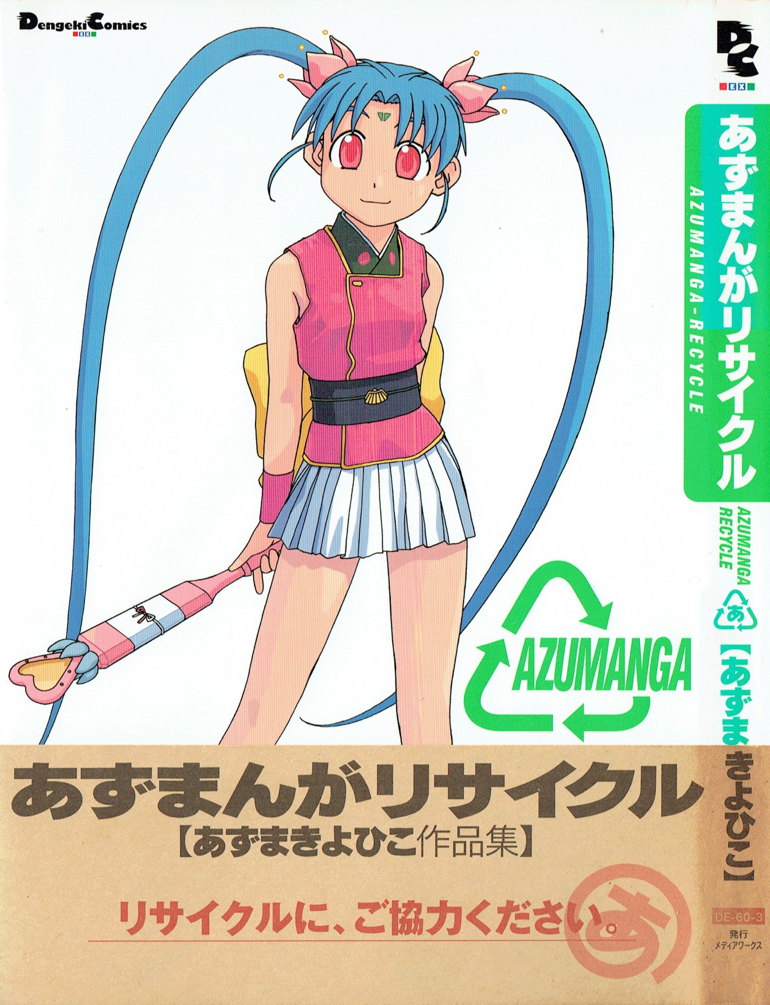
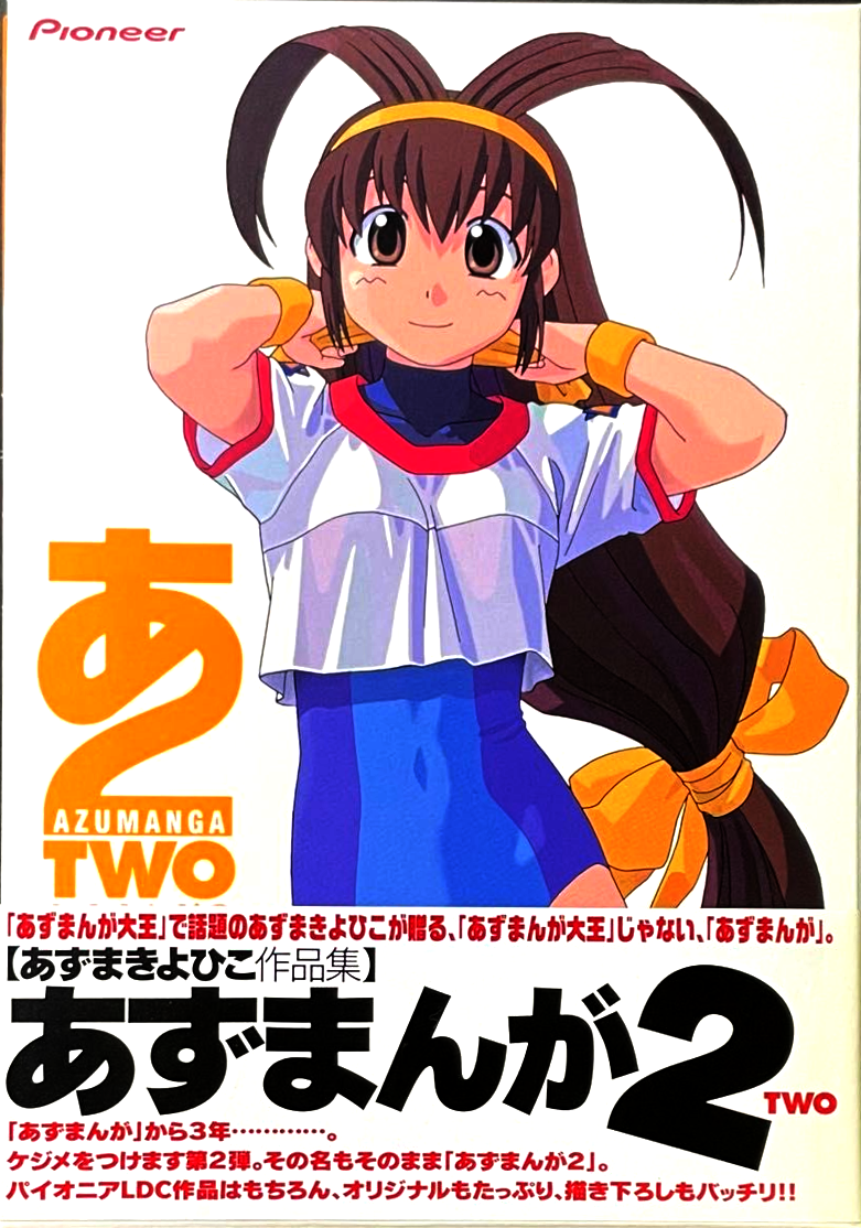
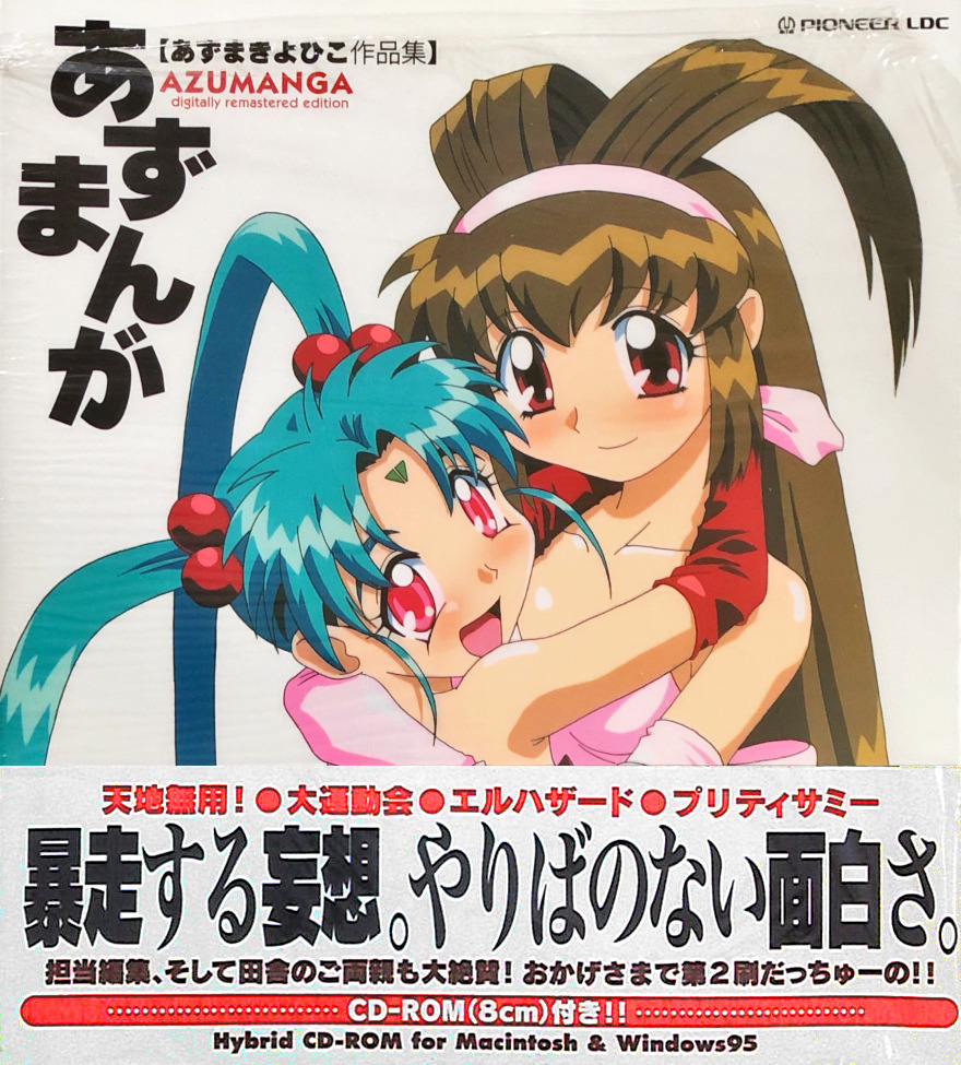
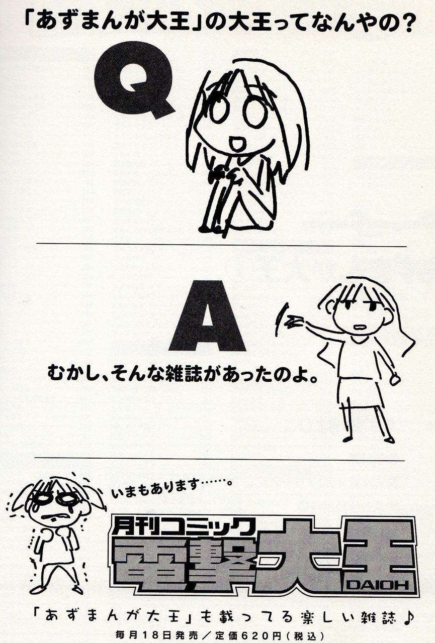
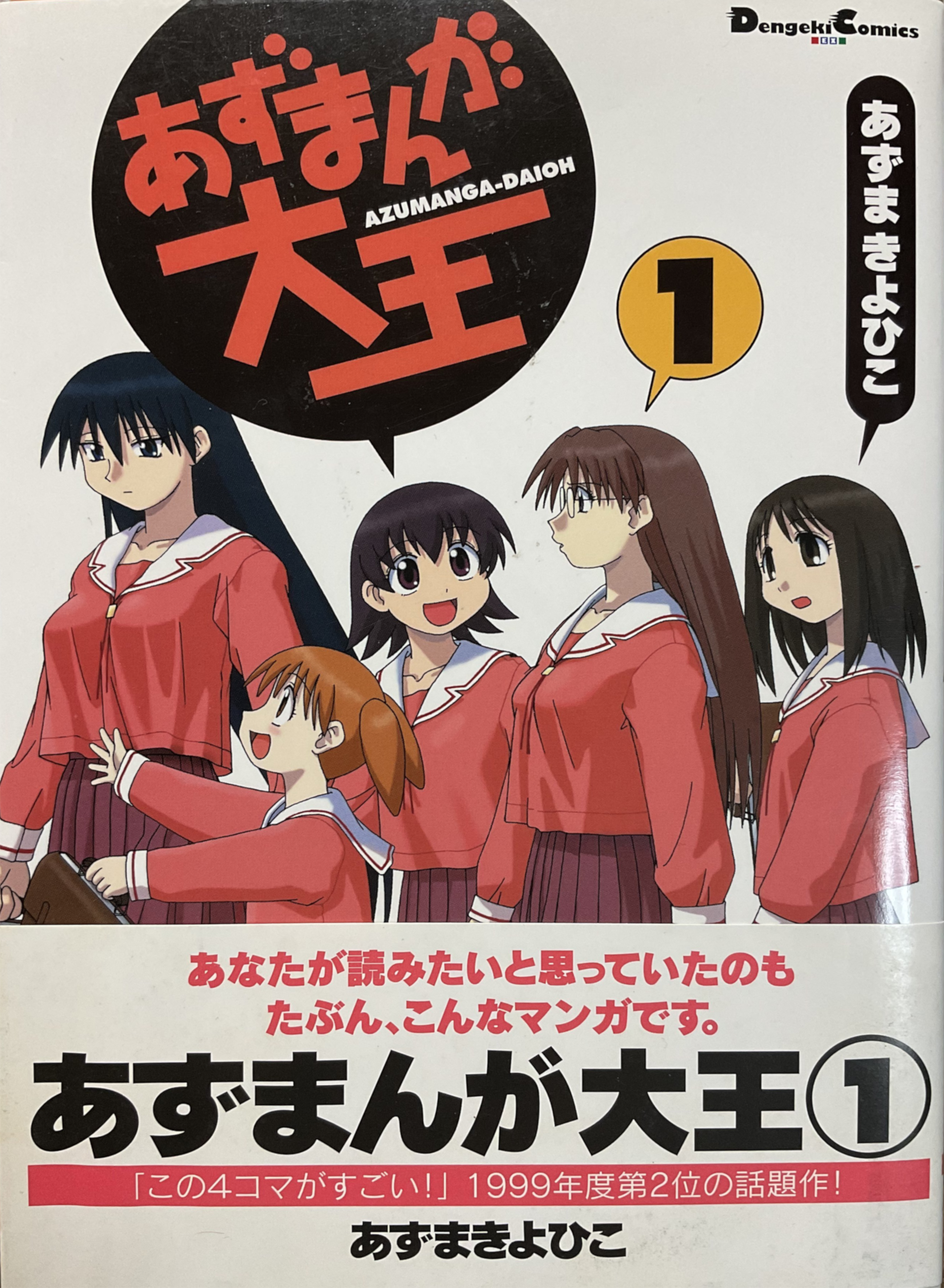
azumanga daioh is a title that has shed pretty much all history backing it. daioh, of course, referred to its home in dengeki daioh, still at this time a fairly unproven magazine, while azumanga was simply a portmanteau of azuma and manga. even before it was old enough to be forgotten, satomi would joke that dengeki daioh still managed to exist by the time of azudaioh’s first volume. what has certainly been forgotten, though, is that azumanga first existed as a humble anthology for tenchi fans, collected and promoted by satomi as a sort of a culmination of their professional relationship up to that point. it was thanks to that effort that satomi became the first point of contact for a publisher looking to poach azuma for a serial manga2. azudaioh’s success would lead satomi to act as azuma’s fixer, continuing to work on promotion and later publishing another two fanbooks contemporary to azudaioh that surely weren’t meant to invite any confusion: azumanga recycle and azumanga 2. rather than acquiesce to something more commercially palatable, satomi took lessons learned from his early freelancing and began to lean even harder into shrewd copy, so much so that his covers began to feel like riddles on par with shigesato itoi3. satomi was steadfastly devoted to being azuma’s support, but you wouldn’t be faulted for thinking he was really out to sabotage with the way he framed azuma’s work as both recycled and second-rate. this marked an inflection where hidemi’s dry humor was truly allowed to develop as a signature.
more than just dry, satomi relies on a coy playfulness. in many cases, that presentation slips off of the margins and is rooted in an imagined rather than strict truth. while satomi freelanced for the most part alone through his own company, triathalon, credits in many of the books he worked on listed multiple names working there that supposedly contributed regularly on design. none of these people, in fact, exist at all. while this may have justifiably been done to develop an air of legitimacy, it speaks to an insecurity that satomi has long harbored, recounting that he is tremendously critical of his own work2. this element became more visible especially in his copy when he broadened into manga, as he expressed a desire to expand the audience for azuma’s work to a public likely guarded against an interest in cute girls doing cute things. an initial appearance for azuma in dengeki daioh meant he initially risked being confined to a strictly otaku crowd, and internalizing this fact, satomi fought to maintain an active position between azuma and his publisher. a casual punctuation, he thought, might tease more curiosity from wanderers than the usual bombast of an obi. maybe you’d like to read this manga — the unattributed quote of stock praise makes a convincing case. it was, however, only a silver medal work.
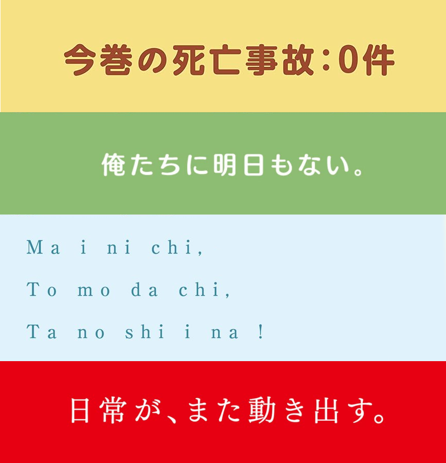
while self-deprecation is still a narrow line to walk, satomi is careful to always ground it to some reality. throughout azudaioh’s run, dengeki also interspersed roundtable discussions between satomi and azuma as the yotsuba studio prosperity chronicle that, without exaggeration, read more like manzai routines. though satomi’s catchcopy stands convincingly on its own, it is a rare window of contextualization to know that each one is perfectly plucked from satomi’s personal jargon of boke wordplay. this alone makes satomi feel like the airhead that truly does live by a cute is justice philosophy, where any criticism can be shooed away with a wink and an extended tongue. most notoriously, ichigo mashimaro a few years into its run would start and stop serializiation without regards to pace, sometimes breaking chapters into five or six page chunks at no particular boundary. while serial chapters can arrive pretty much whenever convenient, a volume of manga expects at least some minimum before it can be reasonably sold, and so ichigo’s volumes continued to slip in cadence beginning by the third volume. at the back of each, satomi seemed unbothered to convey the delays in his own nuanced way, and instead deliberately drew attention to them with an impish flavor text. this is likely one of the greatest examples from satomi’s output of how punctuation can dress meaning, and you’ll notice he’ll often prefer to punctuate with a full stop even for incomplete phrases. a heart followed by a stammering denial is moe, and moe makes everything alright.
| Volume 3 | 「苺ましまろ」好評連載中!ほかにもいろいろ連載中!! | Ichigo Mashimaro is being serialized! Many other things are also being serialized!! |
| Volume 4 | 「苺ましまろ」ほんのりと連載中。 | Ichigo Mashimaro is being serialized slightly. |
| Volume 5 | 「苺ましまろ」好評連載中♥ホ、ホントだよっ! | Ichigo Mashimaro is being serialized♥ I-it’s true! |
“Azuma: You always use your knowledge in a dirty way!
Satomi: I mean, I know what the pee hole and a poop hole are used for, but what is the other hole for?
Azuma: D-d-d-don't be rude and say such dirty things!”
— Yotsuba Studio Prosperity Chronicle Vol.4
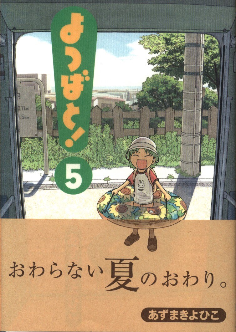
azudaioh’s run, short as it was, was always envisioned as something of a bridge work. given the popularity it achieved, it’s almost astonishing, in a world where anime is now usually made solely as a promotional vehicle for manga or novel sales, to realize that it ended serialization during the middle of its broadcast. this wasn’t coerced or unexpected, as satomi had established yotsuba studio two years prior for no other purpose than to prepare for and realize a transition into azuma’s next work, yotsubato; azudaioh may even be more properly characterized a detour, as the initial azumanga anthology would reveal yotsuba in his first one-off original. from this point forward, satomi’s design bent meant he would also lead an aggressive entry into merchandising for azuma, proven so lucrative that azuma hasn’t seemed to feel a need to expand beyond yotsubato since.
satomi, settled into a producer role, offered a cushion that is not typically afforded to most debuting mangaka that must bend to the whims and asks of editors not necessarily tuned to the balance of their creations. indeed, satomi has remarked this status quo is a balancing act that mangaka usually have to chin up and endure, and it is mostly only thanks to luck that he encountered azuma so early into his career. even though he at no point ever relinquished a creative interest, prefering to maintain a hands-on approach, it is probably owed to circumstance more than anything else that he was allowed to advance a prestiege aesthetic for azuma’s works, and by extension a wider recognition in commercial manga.

today,
the days go on.
The miracle of the ordinary
fascination, as satomi contends, can always be found in the ordinary. because design can often be rooted so directly in the functional, it is sometimes easy to overlook integrated into its surrounding world. while satomi has always demonstrated a keen sense for layouts, his extensive merchandising and expansion beyond the page is what has probably most reinforced his aura. some of these endeavors have landed to equal strength as the works they promote, like the yotsuba daily calendar, an active reinforcement of the every day banal as adventure. he is, legitimately, a designer in the most classical sense of the word, the kind that pays attention to the quality of paper stock and also actively searches for unconventional placements.
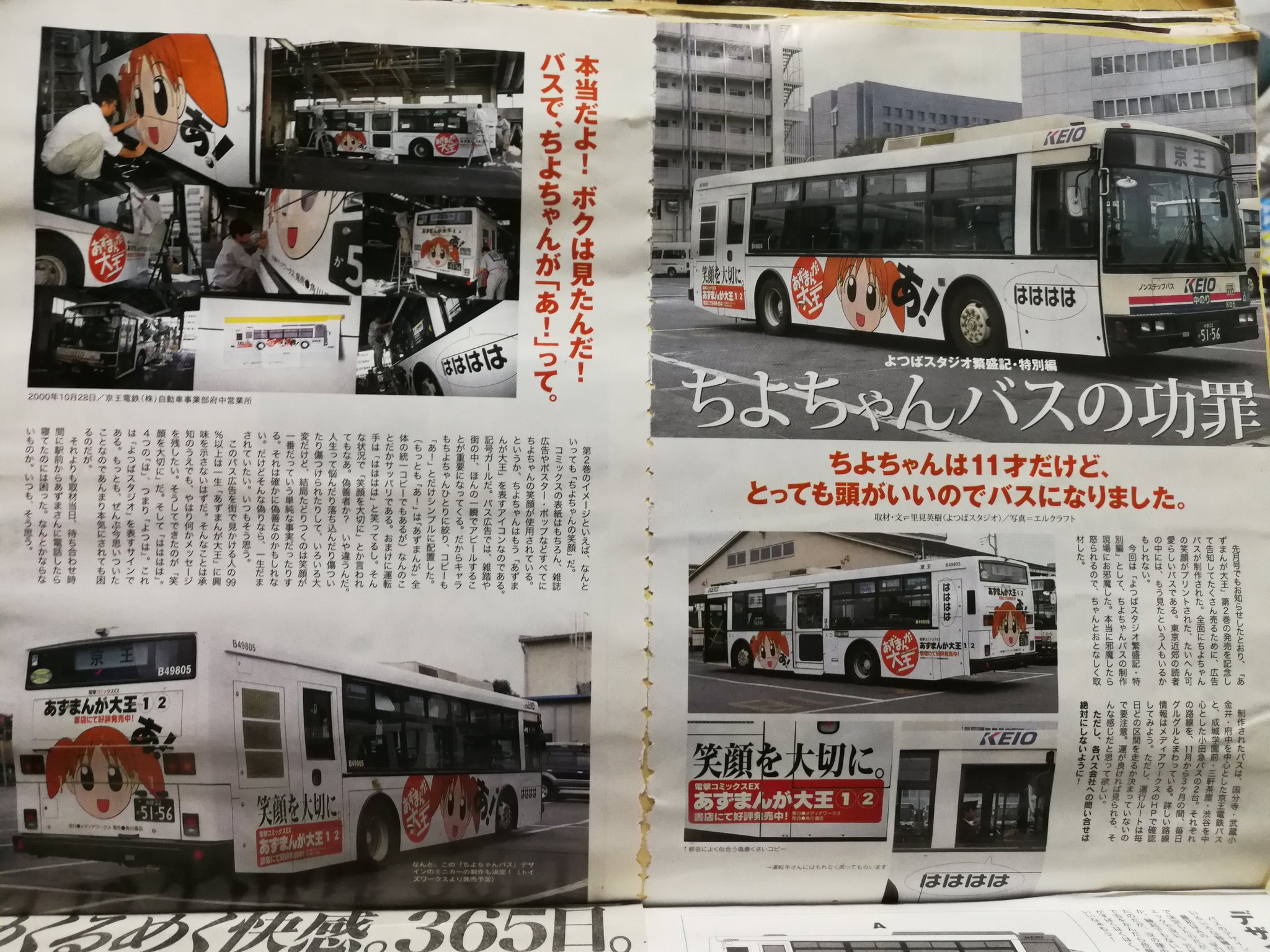
satomi may not have developed the blueprint for character-focused moe, but he certainly understood the rules to play by during its emergence. itasha’s proliferation, the gaudy plastering of character key art over sports cars, is largely a product of the moe boom, but it wouldn’t register as much of a phenomenon until catching on through the mid aughts. on that cusp, a few franchises did successfully toy with overtaking trains in decoration, but satomi holds the distinction of realizing the first of its kind with the moe bus4, a custom wrapped bus featuring chiyo from azudaioh that ran across routes in tokyo. this exterior may look stark to a modern understanding of itasha, even knowing it is trademark to satomi’s style, yet it could not be more appropriate that satomi would choose to decorate something so utilitarian where it had the best chance of being seen by untraditional audiences. outdoor advertising is one of japan’s most lucrative markets, and owing again to a maximalist approach, typically overwhelms the senses. the azudaioh bus, somehow, stands in contrast even as the prototype for louder wraps that would follow. this was an era where sound trucks dotting city streets had now increased tenfold over only a decade thanks to softening regulations, leeching advertising trucks into city blocks that circled routes, so the choice to use a simple exterior here is amazingly polite in comparison. 99% of people, satomi remarked, may never notice the chiyo bus at all. for the rest that did, he wanted to incite a curiosity that rewarded attention rather than push a sales pitch.
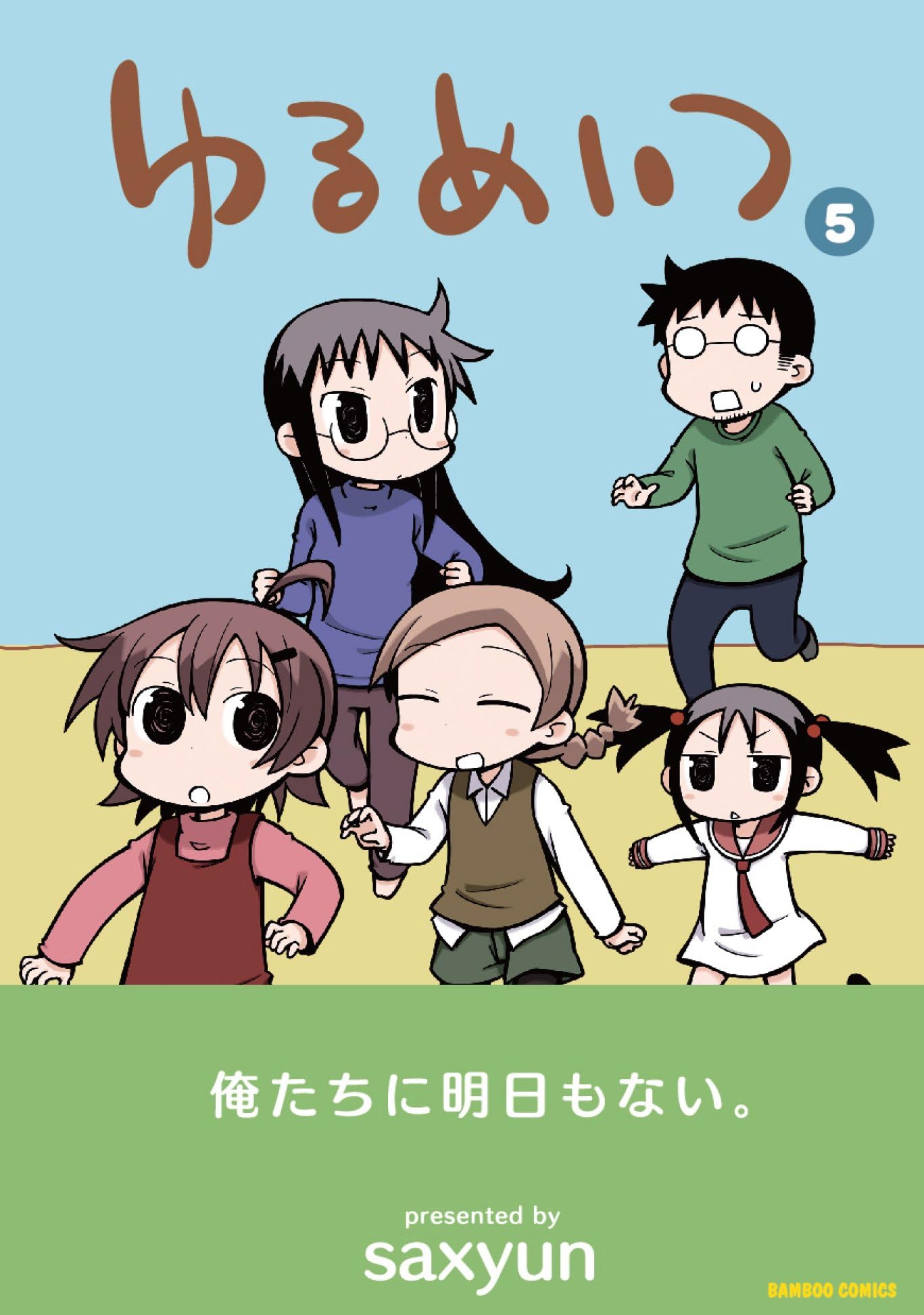
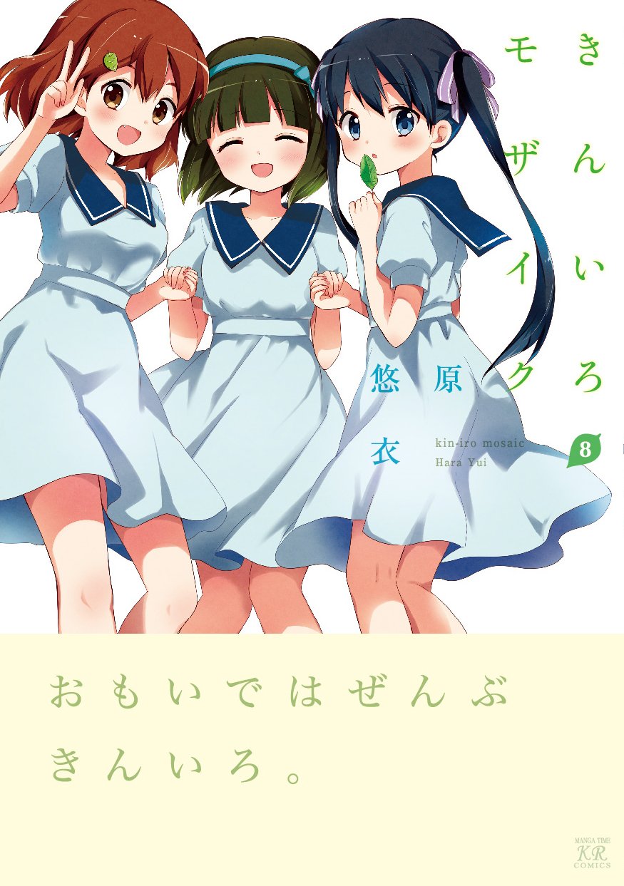
even so throroughly devoted to azuma, satomi was never able to shed his freelancing spirit. his choice to shield himself behind a company name may have actually worked against his own interests, as the work he did for azuma was so well received that he began to field inquiries from other publishers that he felt he couldn’t turn down. satomi’s design would then be lent to countless manga beyond his azuma sprint, mainly for manga time kirara and its various offshoots, but most centrally four-panel slice of life comedies: kiniro mosaic, a-channel, kill me baby, yurumates, and countless others that have never been cataloged fully. these projects lacked the vertical integration that gave satomi true opportunity to exercise a cohesive vision, as most were limited to performing strictly jacket and obi design, and others appear to show more evidence of publisher meddling, like paniponi. nonetheless, despite branching out quickly, satomi was able to refine a recognizable house style that became respected and resisted encroaching promotion, still sharp as ever and exhibiting his same trademark catchcopy5. he was now, figuratively, everywhere. being ordinary, though, doesn’t mean you have to give up being special.


-
people have more recently attempted to backronym obi into “outer band insert”, so maybe this’ll be a perfectly cromulent substitution in a few more decades ↩
-
satomi’s interview in IDEA 334 (2009-05), being one of his only, is invaluable for anecdotes like this: http://www.idea-mag.com/en/idea_magazine/334/ ↩ ↩2
-
itoi already attracts wildly effusive praise overseas, so you might be surprised to hear me say I think he’s not appreciated nearly enough for his strong copywriting and promotional sense. “this game stinks” may not have stuck the landing on localization, but you might be able to see how someone could have gotten there following his lead: https://iso-labo.com/labo/words_of_ShigesatoItoi.html, https://www.youtube.com/watch?v=z8YaKuWLvGs ↩
-
no relation to the exploding bus: https://www.youtube.com/watch?v=J6AkQq7vXsE ↩
-
one of my personal satomi favorites comes courtesy of a chinese wife and an otaku husband, a collection of comics originally published as blog posts, where he coined the truly great “sino-japanese relations are strange.” ↩